Improving the Food Ordering Experience
A UX research case study focused on making a food ordering app clearer, faster, and easier to use. Through moderated testing on an interactive prototype, I identified friction points in navigation, product information visibility, and the ordering journey, then translated those findings into targeted UX recommendations.

Services:
UX Research, Usability Testing, UX Strategy, UI Recommendations
Industry:
Food Tech
Timeline
7 Weeks
The Challenge
The main challenge was to make the ordering experience more intuitive while helping users access critical information more easily. The research specifically focused on product availability, allergen visibility, nutrition details, food preferences, categorization, cart actions, and the overall flow from browsing to ordering.
Important product information was not always easy to find
Some navigation patterns created hesitation during browsing
Users with dietary restrictions needed faster access to allergens and nutrition details
The add-to-cart action lacked clarity
The experience had room for better personalization and upsell logic
The Process
I started by defining a set of hypotheses around product information, navigation, accessibility, and purchase behavior. These hypotheses were then tested with 5 representative users on an interactive mobile prototype. Sessions were recorded and followed by post-test questionnaires to capture both observed friction and direct feedback.
1. Hypothesis framing
I structured the research around four areas: product information, navigation and interface, accessibility, and purchase engagement. This helped prioritize what needed to be tested and made the findings easier to translate into design actions.
2. Usability testing
Participants were asked to complete realistic tasks such as finding a hot meal for lunch, checking stock status, and consulting nutrition and allergen information. The goal was to observe where friction appeared in the natural decision-making flow.
3. Insight synthesis
The research confirmed strong needs around nutrition details, allergen visibility, and dietary preference filters. It also revealed confusion around hot/cold categorization and weak visibility of the add-to-cart action.
4. UX recommendations
Based on the findings, I translated the insights into actionable interface recommendations, including clearer meal labels, richer nutrition content, stronger filters, a redesigned cart icon, and better placement of complementary product suggestions.
Key Insights
The research showed that users valued clear food information and wanted more control over how they browse. Detailed nutrition information and dietary filters were seen as especially important, while categorization and cart visibility needed refinement. Complementary product suggestions also showed positive potential when presented at the right moment.
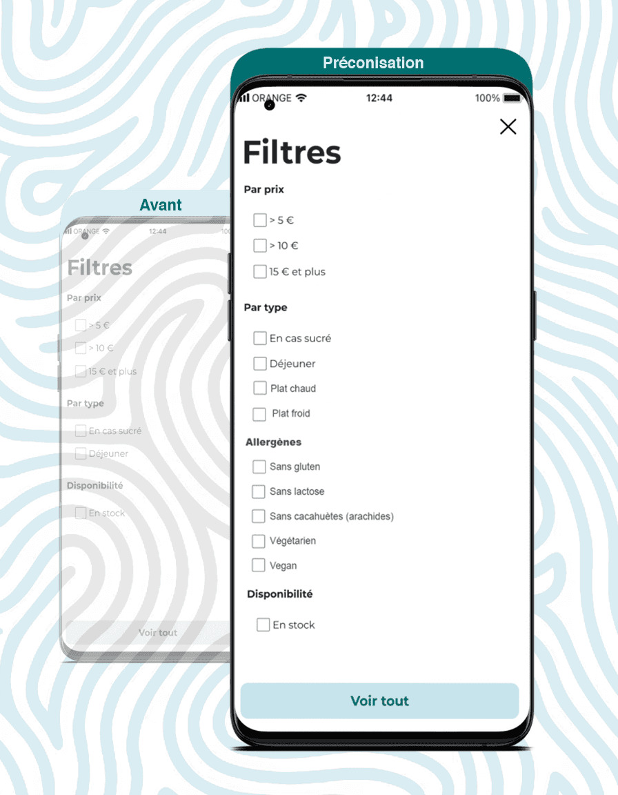
Allergen information needed better visibility
Detailed nutrition data was strongly expected
Dietary preference filters were highly valuable
Hot/cold categorization was not clear enough
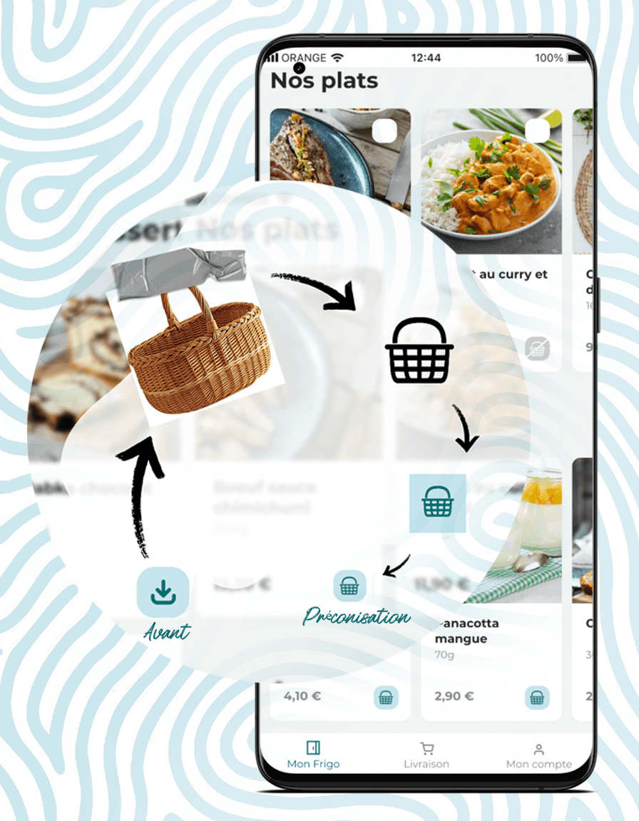
Add-to-cart visibility created friction
Complementary suggestions encouraged extra purchases
The Solution
Rather than redesigning everything at once, I focused on high-impact UX improvements that could make the experience feel clearer and more supportive. The proposed direction strengthened information hierarchy, made important food data easier to access, simplified browsing, and improved confidence during decision-making.
Main recommendations
Add clearer visual distinction for hot and cold meals
Show richer nutrition and allergen details directly on product pages
Introduce advanced dietary and meal-type filters
Redesign the cart icon for stronger visibility and recognition
Suggest complementary products after meal selection, without disrupting the main flow
The Result
This project resulted in a structured set of UX recommendations backed by real user testing. It demonstrates a research-led approach to improving a product experience through hypothesis building, usability testing, synthesis, and prioritization. The outcome was not a fake “success metric,” but a clear roadmap for making the app more intuitive, informative, and user-centered.
Clearer priorities for product improvement
Stronger understanding of user needs around food information
Actionable recommendations grounded in observed behavior
A roadmap for future iteration and optimization